The anatomy of a web page

The anatomy
of a web page

anatomy of a web page

Discovering the key elements of web page anatomy for enhanced user experience and conversions.

Every website aims to attract visitors to your service or product and, eventually, turn them into customers. This is why your website needs to stick to a particular web page structure to make data users are sure it is valid and performs the task well. Besides, this is why many companies look for vendors that provide offerings to build tailored and marvelous websites.

But what does a well-composed website structure look like? There are several essential components to include on the homepage of your website—keep reading to learn more about each.

Essential components of a website

Of course, you can make the welcome page of your website as fancy or simple as you like. But regardless of your site’s functionality and design, it still should be built according to a basic web page plan.

The main components of a good website are a header, hero section, menu, gallery, footer, and call to action (CTA) buttons. Next, come detailed descriptions about each component you must remember when developing your website.

1. Header

One of the essential site elements is a header. The header is located at the top of a page and is the first thing any visitor sees when they visit your website, regardless of the page they land at. Therefore, your website header should be easy to understand and only contain the most crucial information.

Most often, the header would contain:

  • Your company’s logo web address
  • Links to general sections of your website
  • A call to action button

Header of the site

The header of your website is the leading navigation instrument for your visitors. It should give an overview of your site’s sections and provide easy access. Since this part of the front page layout needs to be scannable, thoroughly analyze how you break your website down into sections so that you can only include those at the top of the hierarchy and other vital links.

If your website has a few sections, you may include additional features to enhance the user experience. For example, you may add to the header a search field, social media links, a language switcher, or your company’s contact information.

2. Hero section

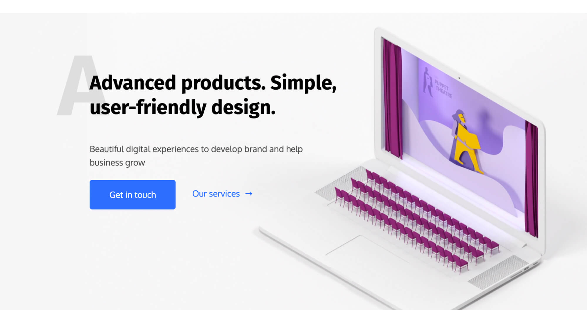
The hero section is one of the most significant sections of a web page. It is located right under the header and is the first screen one sees before scrolling down.

The goal of the hero section is to capture users’ attention, so the content needs to be captivating and engaging. In other words, this section should make the visitor want to interact with the page somehow — through watching a video, playing a game, or heading to a specific page via clicking a button.Hero sectionAmong all the ways to attract the attention of your visitors, you may include an illustration, a short text copy, or a CTA button. Ensure that the engaging content differs from the rest of your website content; it should stand out, capture attention, and invite the user to an interaction.

Remember that the content you include in the hero section needs to be intuitive and visually appealing to attract users to explore the site further. If you make your hero section too complicated for immediate comprehension, or its functionality turns out too complex at first glance, you’ll most likely lose conversion opportunities.

3. Menu

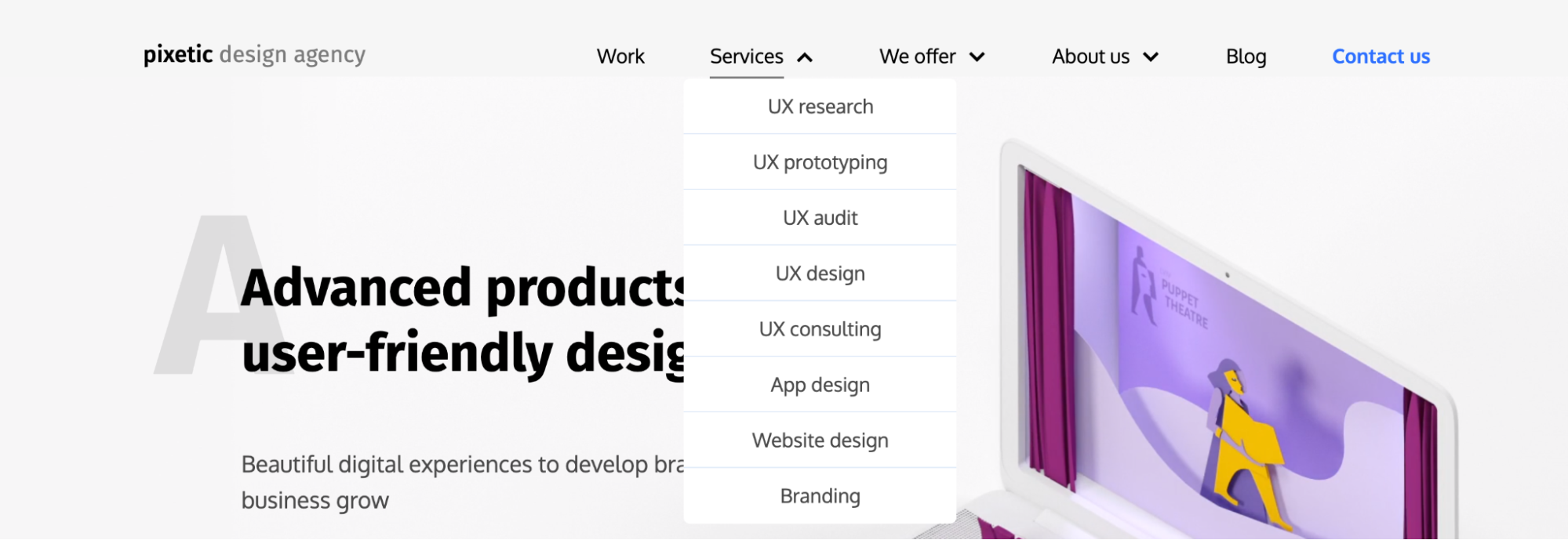
Menu belongs to the primary navigation menu website elements, aiming to provide visitors with a clear structure of the website and effortless access to its sections and categories. The menu needs to be composed according to a logical hierarchy of categories so that your visitors can comprehend where they can find what they need as soon as they reach the menu.

Since you may need to include a short or long list of different categories in your menu, the design of the menu may vary. In general, there are two types of menus according to where they are located: horizontal and vertical.

Usually, a horizontal menu would be located in the header, while a vertical one would be on the left or right side of the page. The latter is also known as sidebar menus. Horizontal menus are the most popular choice because of their simplicity; they are also the quickest to notice when landing on a page due to their location.

A menu may, however, be multi-level or expandable if your website has a complex structure with many pages under different categories. This is when your menu needs to be extended with good design decisions to fit sub-categories. In this case, each or some menu options may include drop-down or drop-up listsMenuBesides the website categories, you can also use the navigation bar to direct users to specific actions, just like in the header. Depending on what your website is for, you can use call-to-action buttons with verbs to guide website visitors. For example, you can lead them to perform such actions as browsing your catalog, buying your products, or reading your publications.

4. Gallery

Visuals are crucial for web usability on any website — they help diversify the anatomy of a website and deliver your message to the users more effectively than text.

However, incorporating visuals into the website can be tricky since overloading the page with images and videos may overwhelm visitors and make it difficult to focus. The result will likely be unfortunate because users can leave the page.

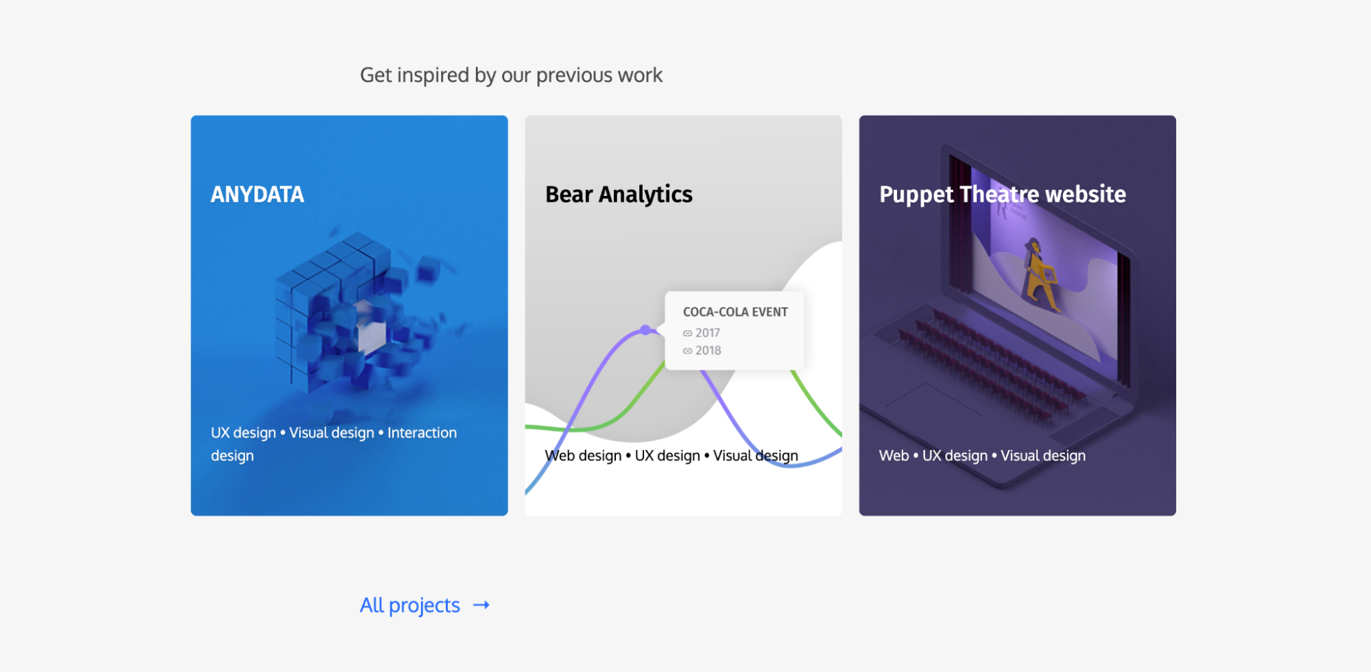
That’s why a gallery is a safe way to visually introduce the company’s portfolio, products, success stories, or any other type of content. The gallery should be a section of your website layout main page and can consist of various web page design elements. There are several design options you can go for with your visuals, such as:

  • grid
  • slider
  • carousel

Using a grid allows you to display several works simultaneously so that the user can grasp all of them with no extra effort. Each element can be clickable to learn more about it on a different page.  GalleryYou can also choose some of the most important works to be displayed and include a link leading to their entire list if there are more items.

A slider allows displaying one item at a time with clickable right and left arrows hinting that there are more elements to see. This way, you’ll save space on the page while still allowing visitors to discover more content without leaving the page.

A carousel, in turn, is similar to a slider in how it functions but displays several items — the main one to attract visitors’ attention and smaller ones on the sides, which one may proceed to with a click or slide.

While these gallery ideas effectively create a dedicated place for visual content without making the page too long, there are some potential dangers to including it in your website anatomy.

One issue you may need help with when using galleries is that your page speed may be reduced. Then, the section may display poorly when viewed on mobile devices or other devices. Lastly, your visual content may be perceived as ads when organized poorly. Hence, visitors will most likely skip it.

While these issues affect the engagement score, they are preventable and shouldn’t stop you from incorporating visuals into your page. Consider different gallery design options to find which fits your site best, then test it and enjoy the result.

5. Footer

A footer is the last part of a website at the bottom of the page. When a user hits the footer of your website, they know that it is the end of the current page. FooterWhile the footer may be omitted if you enable infinite scrolling on your website, it is usually an additional navigation sector for visitors. It is definitely of less significance than the header or the menu. Still, the footer is where you should locate all the general or secondary information for the contact page, such as:

  • Your company’s contacts and location
  • Social media links
  • User support information (i.e., privacy policies)
  • Certifications
  • Subscription button
  • Website creators credits

Remember that a visitor may not reach the footer during the session. That’s why you should include the critical content in other parts of the webpage so that users see it first. Leave the footer for other details, such as those listed, since these won’t affect visitors’ purchase or service use decisions.

6. CTA buttons

Calling visitors to perform specific actions on your website allows you to create conversion opportunities for the target audience. The goal of each CTA is to keep visitors on your website, eventually turning them into customers, hence buying your product or using your service.

The design of the call-to-action buttons should make them stand out to ensure that the visitors notice them as they scan through the page. Here are some rules to follow when creating CTA buttons:

  • Choose a vivid color to separate the button from the background
  • State the action concisely and clearly so that the user understands what information they will receive by clicking each button
  • Scale them to appear more noticeable than the rest of the content

Some of the most straightforward actions you may need your users to perform are to contact you (i.e., “Get in touch”), learn the price of your service (i.e., “Get a quote”) or purchase what you offer (i.e., “Buy now”).

Remember that different web page elements have other goals, such as introducing what your company does or displaying your portfolio. Therefore, you should encourage users to perform diverse actions depending on where you place the CTA.

You can add other buttons throughout the landing page that will call the visitors to perform relatively intermediate actions before deciding to take what your company offers. These may encourage them to learn more about your services or team to check out your success stories.

In general, making visitors interact with your website turns them into active users. That’s why you should call them to various actions here and there so they can perform them at any page browsing stage.

Learn more about how we redesigned Opel’s app and website to bring more traffic. Opel: Standalone Mobile Apps and Website

Other web design anatomy elements

While the parts of a website listed above are fundamental and most often essential, there are some additional features you can add to your web pages, too. The following are helpful tools assisting users in their experience with your site. Learn more about each element next to decide whether they may be beneficial on your website.

Search bar

If your website has many pages, a search field, box, or bar is an additional navigation element you may include in the interface. The search bar, usually located in the header, will help users access the content they need in fewer steps — they need to enter keywords to see relevant pages in search results. In such a way, your visitors reach their goal on the website with less effort.

While search bars are helpful for navigation, you shouldn’t prioritize them over other navigation elements, such as the header or menu. Besides internal search alone, your website may only contain several pages or even a single home page, which makes a search bar an unnecessary tool.

Breadcrumbs

Breadcrumbs are another navigation feature you may use if you have a complex, multi-page website. These imply a trace of other pages a user visits in a particular category, which is tracked in a hierarchical order. Put differently, users get to see the shortest path they have to follow to get to the page they’re currently visiting. The way is often located below the header and the main page content.

You don’t need breadcrumbs for a simple website since essential navigation elements are enough for a straightforward user interface and site structure. But in the case of a website with a complicated hierarchy and rich structure, this website structure element will improve user experience and keep conversion opportunities high.

Tags

Tags are keywords or phrases that appear as alternative names to content categories on your website. These are yet another navigation tool that also serves for content classification. Tags are usually used for simple navigation through the blog or other sections with similar formatted content. Therefore, include the tag selection in the relevant sections but don’t make it the primary navigation tool—it is instead an additional element to hint at the most spread topics on your website or section.

Conclusion

When you work on a website, follow the listed structure of a web page to get an effective website. Conducting thorough user research will help you identify the sections your website needs to provide a successful user experience and generate conversion.

Contact our experts to learn more about the intricacies of web design. Besides, you can also come to us for outstaffing services to get professionals who can build any website structure both client- and server-side.

Other articles

or

Book a meeting

Call (Toll-Free*) +1 (800) 917-0207

Zoom 30 min

* US and Canada, exceptions apply

Ready to innovate your business?

We are! Let’s kick-off our journey to success!