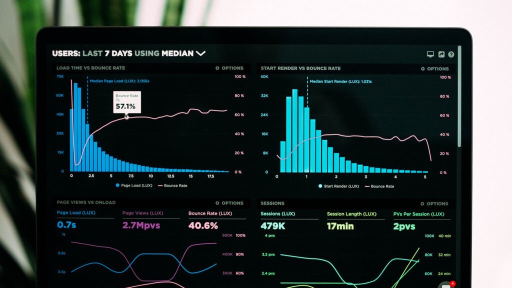
Idea of dashboard
This idea is older than modern IT, well, even older than computers.
Let’s take a look at one of the most successful dashboards ever created, the car’s dashboard.
All the important information is at a glance, updated in real time and with no visual distractions, and all through well known icons representing the state of the car. Speed, rpm and fuel consumption, safety belts status, and lights indicators are all we need to drive the car without being side tracked.
This idea also seems to be great for analysing the business performance of business organizations. And, it has become very important and popular as well.
However, what we are observing now is a dashboard overload phenomenon which is the main theme of this article.
Too many dashboards
Static vs. dynamic dashboards
Static dashboards are often considered obsolete and old school. They are not.
Management and business travellers often prefer a nice output from data reporting than the ability to play with different filters, groupings, etc. They simply do not have time for that.
→Download real-life cases of Avenga data services for enterprises
The point of the dashboard was to enable them to see the data in the real time, however when the connectivity is poor or does not exist, the static PDF with all the graphs and comments is still the best way and sometimes it’s the only way to see the data.
And yes, we will mention the expert’s comments about the data, which are always required for any serious meetings and/or discussions. For instance, an explanation is needed about what are the reasons that sales have not increased by 5%, but just 1%. Some of the answers are in the data, but many of them are not a result of technical analysis, but are fundamental facts and observations which are not part of the data systems of the enterprise.
Static dashboards when exported, also ensure the accuracy of the snapshot, for example, this was the situation at the given time and it won’t change, it’s in the past. With active dashboards, many of us experience surprises, like ‘but this data was here yesterday evening’. It may happen due to last minute data fixes or due to errors in data processing (a night batch of data analytics workload created errors which are visible in the dashboard).
Data systems change over time and it’s very often impossible to go back in time to that given moment to see exactly the same performance metrics. Data changes, systems evolve, and old systems will be replaced by new ones. Static dashboards help to keep the history of reporting.
This isn’t a defense of static dashboards, but an explanation as to why they will last; and it’s not as easy as static equals old-school and that dynamic means modern, which is always preferred.
Of course, management preferring static outputs is an over simplification.
Dynamic dashboards
The goal of dynamic dashboards is to provide business analysts with the flexibility to adapt the dashboards to their needs.
First of all, it means adding filters to the dashboards; sometimes tens or even hundreds of parameters, different criteria and grouping options.
The idea that regular business users will use dashboards efficiently, well, that has failed. In the case of simple tasks, like changing criteria, it was OK, but very soon data engineers were needed anyway to do something more complex.
→Explore Avenga Business Intelligence Services
Platforms, such as Power BI, are very popular nowadays and will continue to be. The prevailing opinion is that it is better to have this kind of flexibility, than no flexibility at all. 
Dashboards, dashboards, dashboards everywhere
The popularity of dashboards made almost everyone want to have their own. They are visually appealing and give the impression that everything is under control in a simple and convincing way. This created the equivalent of Fear Of Missing Out (FOMO) for dashboards. Everybody started to want their own dashboards, so what happened was a dashboard explosion.
Some surveys claim that there are often more dashboards than employees.
When the dashboards were deemed inadequate for the business, the idea was to create more dashboards to fill the gaps and respond to new needs. Some compare it to fighting fire with fire.
Everybody has different needs and those needs change over time. But, even these reasons do not explain such a large number of dashboards.
Deprecating old dashboards is not something that is ever within the focus of decision makers and data teams. It’s always about improving existing dashboards and creating new ones.
So the dashboard graveyards of old, useless and unneeded dashboards are everywhere.
Maintaining dashboards
Dashboards can be compared to the tip of the iceberg of the data processing pipeline so they are very fragile and require constant maintenance to make sure they work and display data correctly.
With each new dashboard created, a repetitive maintenance cost is added. The alternative (skipping maintenance effort) is the inevitable degradation of their quality and usability.
Garbage in, dashboard out
Dashboards with high levels of data aggregation often hide many inconsistencies in the underlying data sources. Raw data goes through pipelines with multiple steps and they help to hide the data errors, including missing data.
→Dive deeper into Data quality at the source pattern – what???
So, if wrong data is on the dashboard it means serious problems in the underlying data and processing pipelines.
And, dashboards are not very useful as debugging tools for data scientists as the aggregation level is simply too high to find the root cause of the data quality problem.
→ There is more about Data Validation Testing
Action required
When dashboards fail, it is also a failure of the ability to perform actions. They can visualize the business performance problem but are close to useless when one attempts to find the reasons why.
It’s one of the key disappointments of dashboards. The manager sees the data and has a choice to believe in it or not, and that’s basically it. In order to do something useful, other tools such as dynamic analytic systems, ML or no ML, will be used which usually involve professional data analysts.
And, that’s when the fairytale about dashboards usability ends. . . . with great disappointment.
Alternatives
Notebooks
Data scientists can be easily recognized by looking at the screen. Jupyter notebooks (open-source web apps designed to create and share documents with live code, visualizations and texts) enable them to transform data on the fly, easily visualise the data, perform transformations, go back to the previous steps, run the steps, and re-run the steps.
This interactive nature of notebooks is very tempting also for business users, at least for the more tech savvy amongst them.
Notebooks can create reports, entire interactive stories about the data, along with its characteristics and properties. It’s like living documentation, of the what and whys, was done with the data to explain the analytical process step by step.
Still, the learning curve is steeper compared to dynamic data reporting in tools such as Microsoft Power BI.
With the rise of low code and citizen developers, we also anticipate the growth of the popularity of notebooks for citizen data analysts.
The data processing engineers and analysts are not going anywhere though, as notebooks have to be fed with the data from various systems, using data lakes, warehouses and data fabric mechanisms. And, they are still out of reach for business users and will continue to be so.
And in case ‘it doesn’t work’, only the pros can help with data or processing issues.
Data stories
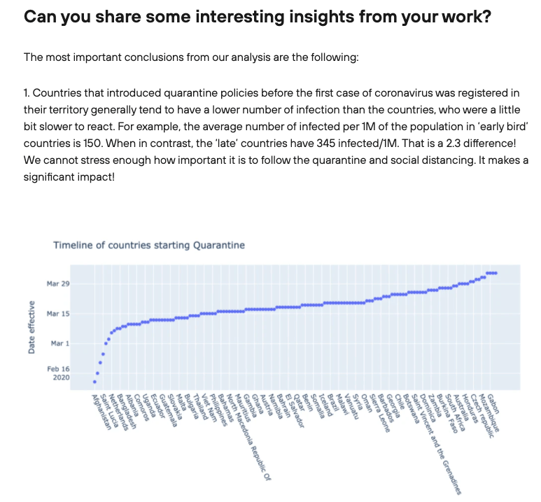
When we present data from reports and dashboards, we are always expected to tell the story, the data story: what we see, why we see what we see, and what we are planning to do about it.
What about converting the data to the story?
This is the main goal of data stories, to create plain text explanations about the data, reasons why, trends, and statistics in a human readable form. It is usually augmented with data visualizations, such as graphs.
Data is more understandable when you can add the context. It’s a growing trend in data-enabled enterprises and business units are expected to tell their stories as it’s about humans at the receiving end. It’s about converting numbers and dashboards into business information, which then turns into actions and decisions.
The benefit of data stories is that an explanation is available right away, and it does not require staring at graphs for hours and trying to figure out what is really going on in this specific business area.
Data stories are personalized for the target audience using their language and focusing on the data that matters to them, instead of generic reports or dashboards. They are too often made available for everyone to see and for nobody to understand.
Data stories can be written as text and images, a kind of report, or even created as short movies, but all actual stories. They last for tens of seconds and tell the most important things about the data and business context for the right audience.
The most common example is the trends reports and survey-based analysis, which many of us read. Please notice it’s not just raw data, nor just dashboards, but the data stories which explain much more and help us to make informed decisions. They often include visually appealing infographics to make it more attractive to the readers.
Fusion
Both notebooks and data stories can be mixed together in order to have the best of both worlds.
See our data story about COVID  Supplemented by notebooks here: https://github.com/avenga/covid19-datascience
What is next?
Dashboard overload, at the expense of their quality and usefulness, is a bad thing.
Properly designed and implemented dashboards are here to stay, including static dashboards and dynamic dashboards. We need to keep our expectations in check and to not expect miracles from the dashboards. Just use them for what they are good for: a first glance at the key aspects of key business metrics. They are very nice and useful when done properly, but that’s it.
There are new options available for businesses to help more people explore data that are much more interesting than creating yet another set of dashboards.
Dynamic reporting, notebooks and data stories are new trends that continue to cross boundaries between professional data analysts and business users.
The Avenga data team is thrilled to explore with you all the available options and technologies for effective data management, BI, data analytics and visualization.


 Supplemented by notebooks here:


