End of Support for Microsoft Products: What You Need to Know
Stay informed about the end of support for Microsoft Office 2016 & 2019, Exchange Server 2016 & 2019, and Windows 10.

This article introduces readers to advanced pharmaceutical data analysis and a case study demonstrating custom data visualization built using Python for natural language processing’s (NLP) named entity recognition (NER), in Power BI on clinical studies data.
With an ever-growing amount of medical freetext, which is barely searchable, hard to sort and organize, the need for augmented data management using data science techniques is arising. According to Statista, the volume of data created worldwide by 2024 will presumably equal 149 zettabytes (that’s 149.000.000.000.000 gigabytes). As for medical data, Statista estimated the amount equalling 2,314 exabytes (2.314.000.000 gigabytes).
Medical freetext is almost always saved in documents. It is a very useful source of information that can substantially enrich EHR data, primarily collected for billing purposes. Even though a lot of documents are saved in predefined format, they still contain unstructured parts.
However, the search within medical documents and databases is quite limited. It is not nearly as intelligent as Google search algorithm: there’s no keyword sorting, no keyword relevance ranking, no ranking of the source expertise, no context searches, etc. There’s no understanding of the search intent, its specifics; moreover, in case of any synonymical terms, the researcher has to search for every synonym separately.
In addition to not user-friendly search, medical datasets (as well as other types of datasets) often contain inconsistencies, such as differently spelled words, varied terms, wrongly entered numbers, or other typos. These errors disrupt data integrity and increase data redundancy (which is bad, as multiple values or even compounded data structures might be saved within a single attribute or field, and these fields might be duplicated within a single table).
These limitations make it harder for medical professionals that work with these texts to classify the medical terms accordingly. That’s why the data science team at Avenga applied data science techniques to analyze, normalize and enrich a text built on information that includes an unstructured freetext part.
Let’s take a closer look at some key processes ensuring sufficient data quality. Those encompass data exploration, cleaning, normalization, enrichment and visualization.
In-depth data explorations through drill-in capabilities.Choosing the most suitable visualization is determined by four critical factors:

Interactive data visualizations are above and beyond the static ones. They are built on dynamic data and they change in accordance to the user’s input, enhancing the impact of the represented information. Examples of interactive data visualizations can be currency rates and stock prices trends, as they are constantly changing.
The benefits of interactive data visualizations over the static ones are the following:
Comparison of static vs interactive data visualizations
| Static data visualizations | Interactive data visualizations | |
| Application / uses | Print brochures and presentations | Websites, videos, social media, business intelligence |
| Costs to build | Cheap | Costlier |
| Connection with a data source | Not needed | Essential for dynamic data visualizations; often come out as elaborate systems that require online data sources |
| Exhibiting | Is simply outlined | Might require sophisticated renders and UI designs |
| Common Python libraries | Seaborn, Matplotlib | Plotly, Bokeh |
In essence, interactive data visualizations alter the conversation about data in the art of storytelling, simplifying the complex trends the data is trying to elaborate on. Interactive data visualizations convey the message in a responsive graphical manner, allowing decision-makers to grasp the trends and patterns instantly and to change the business’ day-to-day operations accordingly.
Out of the box visualizing functionality provided by market available BI Tools is limited by a standard set of graphs and visualizing approaches which doesn’t satisfy the dynamically growing demand of modern Business Intelligence. Thus most BI Tools provide multiple ways to create custom visuals through the SDKs available for several programming languages.
Below we’ll go through the case of using a Python as a customisation instrument for Power BI.
Microsoft Power BI is one of Business Intelligence tools available in the market. It assists with producing interactive data visualizations via simple interfaces and enables end-users to build their own dashboards and reports. Power BI supports the connecting of a wide variety of data sources: Local Files and Folders, Databases on various servers, Internet sites, Cloud drives and so on. The streamlined implementation process of each Power BI connector ensures seamless data integration regardless of source complexity.
As of the February 2019 update, it became possible to create reports, view and publish Python visual elements. Python is used for two tasks in Power BI: 1) to import and manipulate data, and 2) to produce data visualizations. This functionality completes the support for Python in Power BI. First, it enables you to use Python scripts to prepare your dataset. Secondly, it applies sophisticated analytics or machine learning in the Power BI Desktop & personal gateway. Thirdly, it plots the results in your Power BI reports using any of the hundreds of open-source Python visualization packages. Python is a high level, object-oriented programming language that is often used for data science, scripting and software development tasks.
There are three ways to integrate Python with Power BI:
In the case we’ll stop at the first option of using Python with PowerBI – visuals customisation.
Avenga data science team opted for a ClinicalTrials.gov database which contains research studies of privately and publicly funded clinical studies performed globally. With a huge volume of information (over 360,000 clinical trials as of February 2021) and ongoing updates, there are enormous amounts of data inconsistencies across the database: 42 tables contained different spellings, miscellaneous terms used, misspelled words, incorrectly input numbers, and other data inconsistencies caused by human factors. In order to make the fullest use of this information, the data needed to be normalized in order to make it interpretable by data science techniques.
The team used natural language processing (NLP) techniques to identify medical entities and terms (such as disease symptoms, diagnosis, medications, adverse reactions) in clinical freetext. Using named entity recognition (NER) the values from the text corpus were extracted and the words were classified into predefined categories.
NER is the process of identifying predefined entities present in a text, such as a person’s name, organization, location, etc. Basically, it’s a statistical model that is trained on a labelled data set and afterwards used for extracting information from a provided set of data.
Sometimes we want to extract the information based on our domain or industry. For example: in the medical domain, we want to extract a disease or symptoms or medication, etc. The biomedical named entity recognition (Bio-NER) is a major errand in analysis of biomedical texts; for example, RNA, protein, cell type, cell line, DNA drugs, and diseases.
Since more medical-specific entities were needed, not just general persons, geographic locations, etc, the decision was made to utilize the ScispaCy Python library with the submodule ScispaCy that offers multiple pre-trained biomedical models for entity extraction.
In case none of the biomedical ScispaCy models suit the problem well enough, there is always the option of training your own entity classifier. Training a NER model is considered a supervised machine learning task, so it requires both technical skills (for example, dataset labelling) and deep domain knowledge (medical terminology in this case) as well.
After extracting entities from a corpus of documents, in this case from trial descriptions, it becomes easy to navigate towards similar trials. For example, finding all the trials that can be classified as “cancer-related” or “living organism-related“. Extracted entities play the role of keywords, which can quickly provide insights about the majority of the trials’ area of focus. Instead of browsing through free-texted descriptions, one can simply view a trial as a set of domain-specific keywords.
One of the ways to work with extracted entities is to highlight them directly in the text providing additional inline information like entity type or entity domain. And that actually was the task, our data specialists decided to solve using PowerBI custom visuals implemented on Python.
Before using Python’s visualization in Power BI, the following things need to be done:
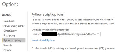
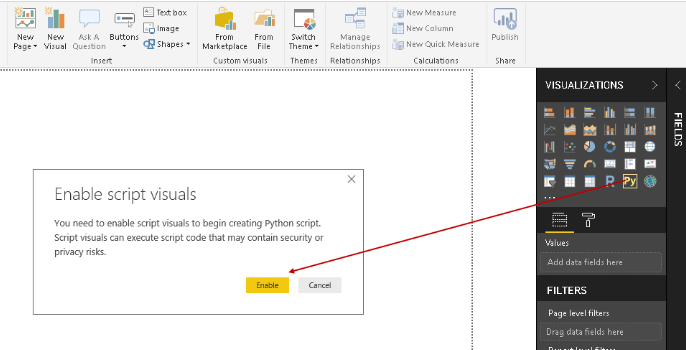
Creating Visualizations with Python in the Power BI Desktop
Now, it’s possible to use Python with Power BI. Again, Python is used for two tasks in Power BI: 1) to import and manipulate data, and 2) to produce data visualizations. Let’s take a closer look at these . . .
Importing data into Power BI is a fairly simple process. In Power BI, the following tabs have to be selected: Home > Get Data > Other > Python script.
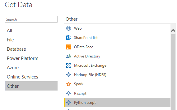
The code can now be entered into the Python scripting window and a dataset with a brief description of each clinical study can be imported into it.
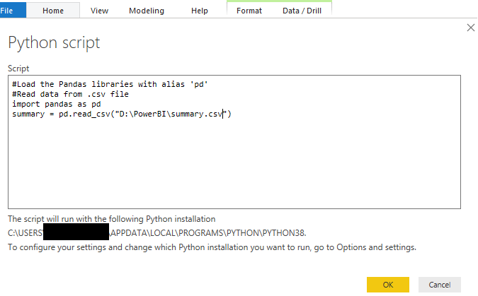
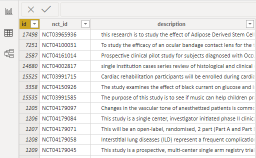
After the button OK is clicked, the data will be loaded. Below is a sample of the downloaded data.
A Python Visual has to be placed on the canvas to create the visualization.
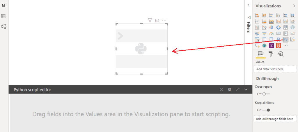
One can’t start writing a script without dragging values onto the visualization. At first, the fields need to be selected that will be included in the script. Let’s select “description”.
In the Python script editor, Power BI automatically creates the data set using the “Pandas” data frame with the required column from the data fields. Now, the script can be written or the changes can be made in the existing one.
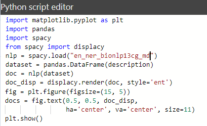
Wait, there was an error after running our script. Let’s examine the script and see why the error occurred.
![]()
Let’s rewrite the script and create the visualization using the “matplotlib” library.

Below is the result of executing this Python script. The model processed some text (we really got named entity recognition (NER)), BUT the “plt.show()” method didn’t process the html-expressions to represent the selected entities.
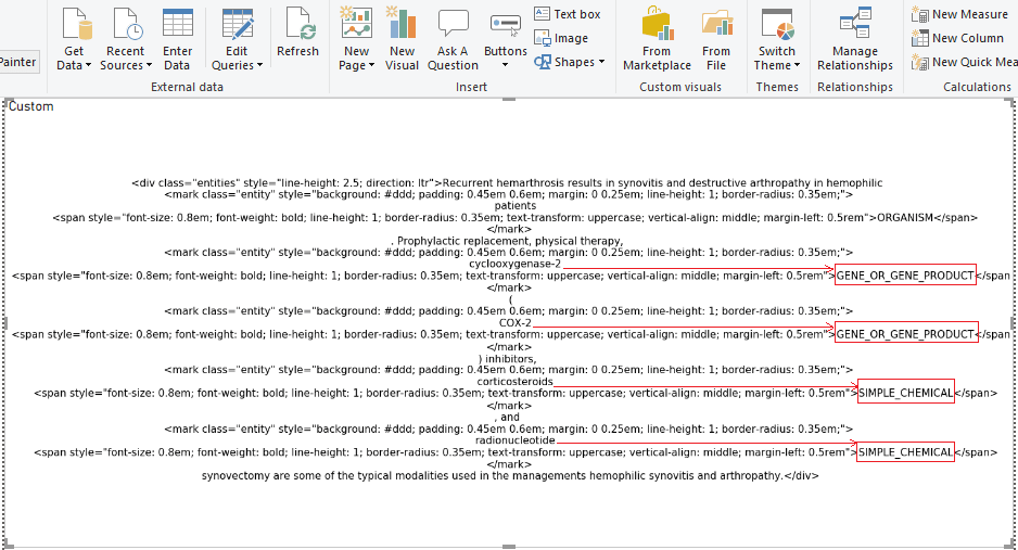
The decision was made to create a visualization of the NER model to correctly display entities in another way.
Creating a Python script (shown below) that:
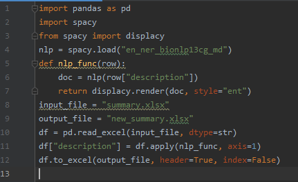
Let’s examine the data obtained in the output file. It’s the same as in the Python visualization within Power BI (the html-expressions weren’t processed).
Let’s go back to Power BI.
Since we already know how to load data using Python Script, let’s load the resulting source file into Power BI.
Next, it’s necessary to load a custom visualization called “HTML viewer” (from marketplace), which has the ability to process HTML code.
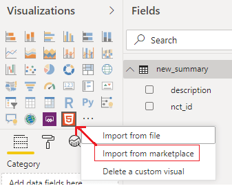
The output of the HTML-visualization above looks like this:
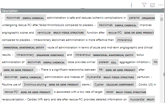
In the output, the named entities are seen to be highlighted in color along with their entity types.
The following visualization shows the NER model trained on medical texts, to recognize the following entities:
Important note: the model can be retrained to recognize entities that would other match business needs more closely (e.g. extract entities called “diabetes”, etc).
The solutions proposed in this article offer ways to optimize the data in order to generate statistics later on, depending on the problem that is being solved. State-of-the-art NLP techniques and models can offer a new perspective with available data and generate meaningful insights.
The exponential increase of the medical data volume urges pharmaceutical companies to think how they can make a better use of information they possess. In particular, medical freetext is a very rich source of information that can provide new insights and findings. However, search possibilities in medical freetext are quite limited: there’s no keyword relevancy ranking, no context searches, no expertise ranking.
To tackle this problem Avenga data science team utilized NLP to identify medical entities and terms (such as disease symptoms, diagnosis, medications, adverse reactions) in clinical freetext. Notably, named entity recognition was used to extract the values from the text corpus and to classify the words into predefined categories.
Prior to utilizing NLP techniques, the data scientists needed to ensure the information is of sufficient quality. In particular, data exploration, data cleaning, data normalization, data enrichment and data visualization were described. These methods enable to find out anomalies, errors and coarse data, ensure data consistency and accuracy, and establish data validity across all the parts of the dataset.
After data is harmonized and enriched, it can be visualized using static and interactive visualizations. Data visualizations held to find out the relationships, correlations and patterns, hidden in the data. It produces value for decision makers and enables everyone working with the data to grasp it better.
Also in this article we presented a case study on how to utilize Python to build effective data visualization using NLP’s named entity recognition (NER) in Power BI. The visualization that was built represents extracted entities from the dataset taken from ClinicalTrials.gov that contain data on over 360,000 clinical trials, as of February 2021. The explicit data insights, derived from a clinical trial data set, has been clearly demonstrated. Some critical issues that data science specialists may come across when dealing with similar datasets were uncovered.
No matter how elaborate or perplexing your needs are, don’t be afraid to discuss them with a team of professionals. We will do our research and help you navigate through the uncertainties by delivering the solutions you require.
Ready to innovate your business?
We are! Let’s kick-off our journey to success!