Computers enter offices
A long, long, long time ago in the 1980s, personal computers were massively introduced into offices and homes.
Since that time, desktop app developers, then web developers and mobile developers, UI/UX designers have constantly improved the user experience of the applications, both for customers and internal users.
→ Explore Avenga expertise in Customer Experience
Skeuomorphism
Office workers were used to physically processing documents on paper using various physical tools, which included typewriters, sending physical letters, calling business partners and using stationary phones.
To make computer interfaces more efficient to the users, the idea was hatched to create physical metaphors on the computer screens for the physical objects.
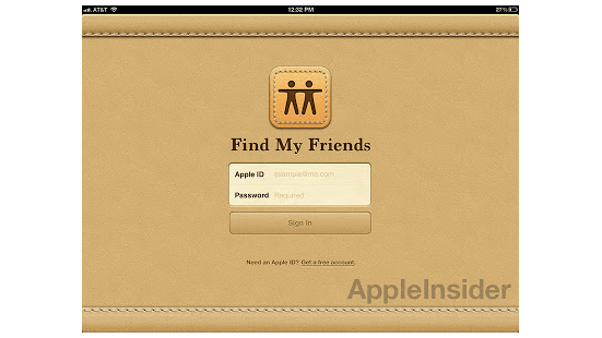
In the beginning, the on screen imitations were poor because of the limited graphical capabilities of the machines at the time.
Please note the leather type textures.
Reading books was like they were paper books.
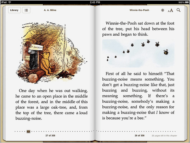
From the wooden bookshelf…
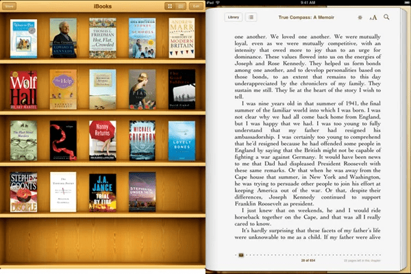
With the digital revolution gaining traction, using these types of user interfaces were starting to resemble visits to some kind of museum of vintage objects and devices.
I personally disliked this kind of design as excessive and overloaded, as it doesn’t truly represent technology advancements and is overloaded with too many visual elements and useless distractions.
→ Explore more trends in Contactless user experiences – for a safer customer experience
Flat design revolution
Skeuomorphism became very dated. New generations of office workers used their PCs or Macs as their primary tools and physical objects stopped being used for data and document processing.
The idea was to create a revolutionary digital-first interface design language for digital natives, getting rid of old physical metaphors.
The primary topics were a lack of distractions and minimalism in the colors, shapes and fonts used.
The most visible beginnings were clear to the broader audience with the introduction of the Windows Phone. An otherwise failed Microsoft attempt to rebuild their mobile presence, but with revolutionary UI at the time which got a lot of attention and … followers.
There are flat monochromatic icons, with no shadows, no gradients, nor leather skin textures.
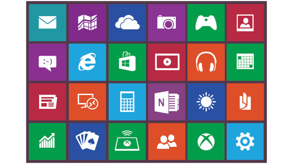
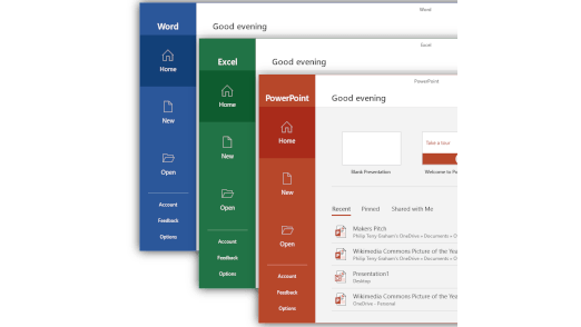
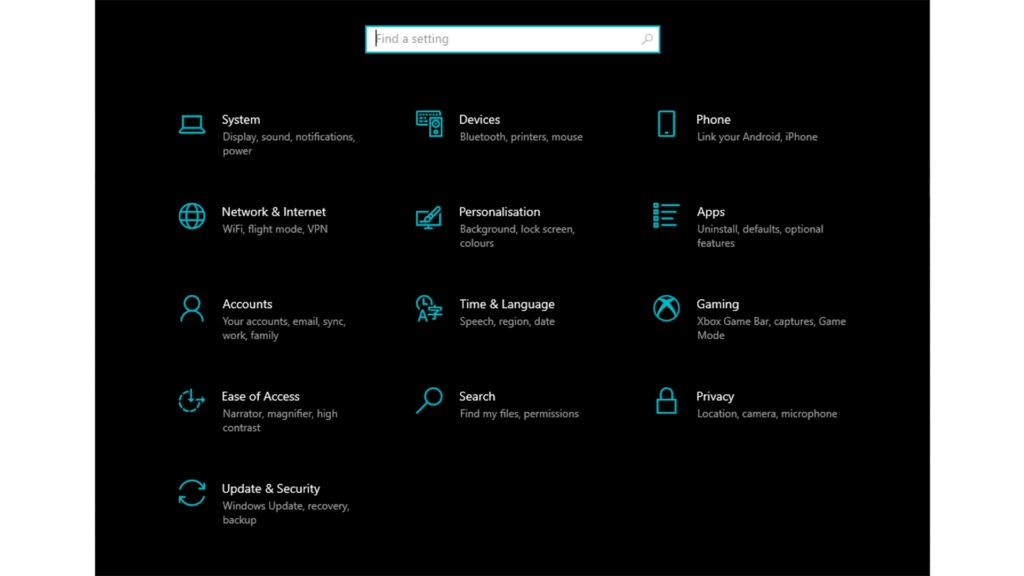
This is visible to this day in Windows 10 interface elements (Start menu especially or Windows Settings).
Then, Apple followed with iOS 7.
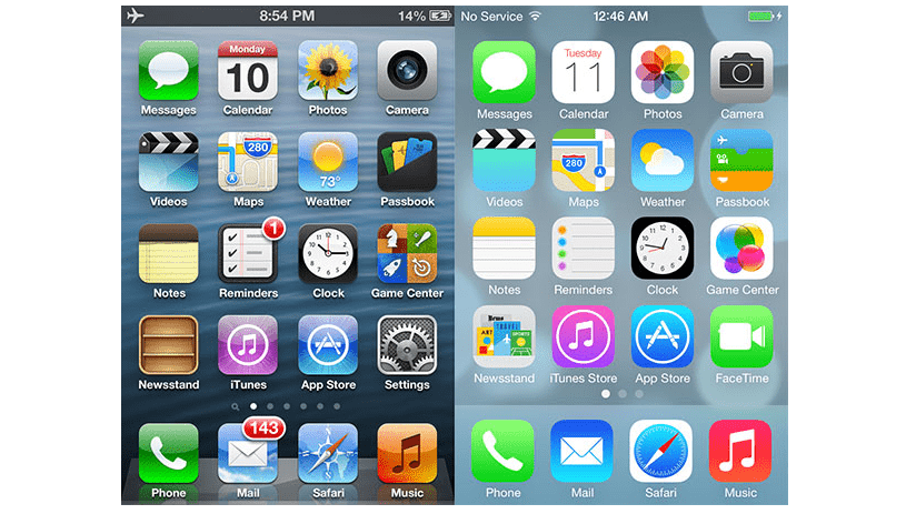 As you can see, it is a less flat design, but compared to the glassy colorful icons they are much flatter (on the right side).
Material design
Minimalism was really liked by the designers, so they played with the minimalistic rules of visual distractions and analyzed how to minimize them even further. But many people started to become bored by the ultimately flat interfaces that were often monochromatic. They did not give too many visual clues to help users to understand what to do next in their applications.
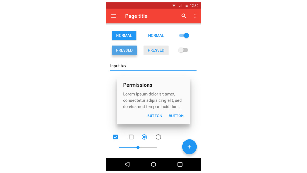
Then came the material design trend which was attributed to Google. It meant a comeback of the third dimension in UI where the depth, multiple surfaces, and elements can be on top of other elements, such as the famous plus button in the GMail application.
Shadows are back, delicate gradients are back, but not the physical textures of old.
Material design can be visible in all of Google’s products in 2020 and in most of the modern web applications.
→ Explore more about Web apps – all the things you don’t have to do on your own

Fluent design
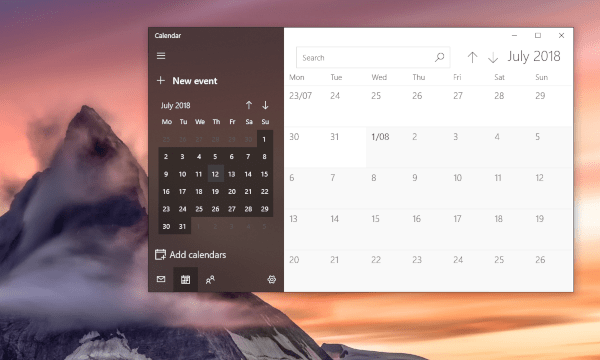
Microsoft, after reaching the most minimalistic interface level, started to reintroduce more visual elements such as light, a little bit of depth and shadows.

The acrylic look of the windows with emulated transparency is back in a new form.

Neumorphism
Return of skeuomorphism in disguise?
As you can see, after the sudden revolution from skeuomorphism to flat, the interfaces are gradually becoming more rich again.
The newest representation of this trend is neumorphism, the most talked about design trend nowadays.
Does it mean the return of fake leather textures and wooden bookshelves?
Fortunately and definitely – no!
What is neumorphism about?
My simplification is this: take flat UI design and add to the UI elements delicate soft shadows, then play with very subtle and delicate gradients of the entire screen, and in other words, lower the contrast of the UI elements. The color palette is soft grays, grays, and beige. Shadows are soft. Elements are either sunk or protruding from the virtual surface.
And here are many more examples: https://dribbble.com/tags/neumorphism
Some experts call this UI design language as something half-way-back towards the past of skeuomorphism, while others an incremental evolutionary step towards richer UIs.
Neumorphism and accessibility
The typical argument against neumorphism is about accessibility, people with impaired vision will have problems finding interface elements and interacting with them due to the low contrast and soft shadows. Very often there’s no contrast between the button and the surface, just a soft shadow. There’s often a lack of labels and visual clues. It’s hard to figure out which elements are clickable as shadows are everywhere, and the only subtle differences between them don’t help.

This is what a typical neuromorphic button looks like.
The fans of this approach claim that better visibility can be achieved by increasing the contrast between the elements, making them much less soft and achieving the minimal required contrast ratios.
Others want to abandon this trend before it becomes very popular and to focus on the next thing in UI design.
Neumorphism – the way of the future?
People scared by the return of skeuomorphism can relax. There’s a new trend with a similar name, but it is much more digital, subtle and elegant.
What is next for design languages?
Will interfaces continue to become richer and richer, or are we expecting another flat/minimalistic revolution to get rid of all the accumulated “bloat”?
As usual, all of them will continue to co-exist, with varying and dynamically changing popularities.
Avenga UX team can find the best solution for your digital product needs, always prioritizing ergonomy and accessibility of any design.


 As you can see, it is a less flat design, but compared to the glassy colorful icons they are much flatter (on the right side).